
OLLECH & WAJS - A LESSON IN UNBRANDING
In the world of branding, certain rules have long been considered sacrosanct. Consistency and a clear association between logomark and brand name are often cited as cornerstones of a successful brand identity. Yet there are rare instances when a brand blatantly disregards proven principles and still manages to capture hearts and minds.

One such enigmatic success story of branding that flies in the face of best practice is the famous OW propeller monogram.
It may surprise you to learn that the name Ollech & Wajs has never been part of our brandmark, nor did it appear on a single watch dial for our first 60 years.
By conventional wisdom, such a marketing strategy should be ineffective and doomed to fail. But for almost seven decades, our two-letter brandmark — and, we’re pleased to say, the brand it represents — have endured and become shorthand the world over for quality and durability.
To understand why Ollech & Wajs were reticent to sign their watches with the full company name, we have to go all the way back to 1958. Two years after founding Ollech & Wajs as a distributer of fine watches, Joseph and Albert decided to launch their own watch collection. Neither of the young entrepreneurs came from Swiss watchmaking families. Both had relocated to Zurich as refugees shortly after WWII, and neither the name Ollech nor Wajs sounded particularly Swiss. The partners knew doing anything to overtly identify themselves as ‘outsiders’ would not make it any easier for them to succeed in the fiercely competitive Swiss watch industry.
Secondly, there was the very practical issue of pronunciation. Being multilingual, Albert had the foresight to anticipate the challenges the names Ollech and Wajs might pose in potential markets such as Italy, Germany and Britain. They would be relying heavily on word-of-mouth recommendations for exposure and recognition, but if people struggled to say the brand name, there would be a barrier to them talking about it. Even today, there isn’t absolute consensus amongst our customers on how to say the name Ollech & Wajs. (‘Olleck & Vice’ is how we say it.) The third reason for not printing their full names was small but equally practical: the matter of size. Space is at a premium on a 32mm dial, and an unusual brand name — especially one including an ampersand — isn’t especially easy to read when printed in 5pt-size font or smaller.
The solution, both men reasoned, was an acronym. It would be universally understood anywhere in the free world and sufficiently ambiguous as not to raise local eyebrows.
The inaugural graphic iteration of the Ollech & Wajs Watch Co. brand was born: OWZ.

The logotype comprised three angular letters — O,W and Z — with the Z denoting Zurich, the location of the company. In keeping with the design codes of the day, the same three letters coalesce above the initials to form a crown-like, geometric motif. It is also possible that the symbol was an early depiction of the propeller, which would soon become a tenet of the brand. Either way, the logo conveyed prestige and modesty in equal measure. It reflected OW’s promise of quality Swiss timepieces, priced within reach of the working man.

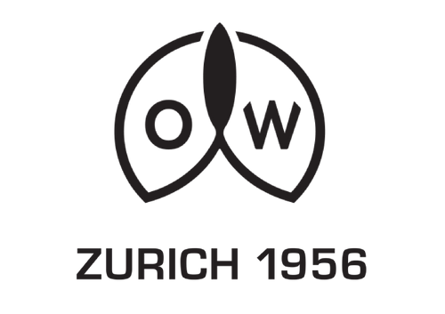
Barely a year after the OWZ logo ushered our new Swiss watch maison into the world, along came the famous OW propellor monogram, establishing the connection with aviation that really helped the brand take off. Designed by Jospeh Ollech himself, the new logo dispensed with the letter Z. The O and W became encased in a roundel, at the centre of which was the unmistakable silhouette of an aircraft propeller blade. Not only did the round shape imply cyclical, dynamic movement, but it also cleverly echoes the O and the W.
However, the new OW logo did not replace the existing one. When we look back, through a modern lens, on the genealogy of any historic brandmark, it’s easy to assume there was a gradual and considered progression from one logo to the next, as logos were routinely updated every decade or so. In reality, this is rarely the case, logo evolution is a far messier and ad hoc process, and the introduction of a new logo does not always herald the discontinuation of its predecessor. This was certainly true of our first two logos and of the many versions that followed.


The angular OWZ brand mark remained in use for several years, alongside the propellor logo, on selected models and in certain markets. They even coexisted in the same markets and occasionally on the same models! But the OW propeller monogram (as we now call it) soon became the preferred emblem for the company. Its introduction coincided with a greater focus on specialist timing instruments for professional and sports markets. Ollech & Wajs soon found a strong customer base amongst pilots, motor racing driver, engineers, soldiers, sailors and scuba divers, who knew that any watch bearing the letters OW beneath its crystal would be equal to any challenge.

OW Aquagaurd, 1962 (Left) OW Precision Caribbean 1000, 1964 (middle) OW Chronographe Valjoux 92, 1967 (right)
The next decade saw many tweaks, modifications and alterations to the logo, not all of which were down to Ollech & Wajs. The application of logos onto dials was carried out by the dial manufacturer, and the ultimate responsibility of the draughtsman/woman, who would painstakingly prepare the artwork for printing by hand, using pencils, Rotring pens and a radius curve. Inevitably, the subjectivity and skill of the individual artist was a factor in the end result. Under scrutiny, it’s possible to see human idiosyncrasies and quirks across the various brandmarks on watches created between 1959 and 1969. Some logos appeared on several OW references, while some logos were unique to a single reference. During the Vietnam years, when the volume of orders was at its peak, OW had to spread the work simultaneously across multiple suppliers to meet demand. This meant that logos would often vary from one production batch to the next.


Despite these slight inconsistencies in execution, the basic propeller monogram concept remained unchanged, and not one watch dial carried the words Ollech & Wajs. Occasionally, the inside of a case back was stamped ‘OLLECH & WAJS’ and sometimes movements were signed OLLECH +WAJS, but this was primarily for the benefit of watchmakers during servicing.

It would be virtually impossible to arrange every single OW logo on an accurate timeline, or even to catalogue each example — there are nuances within nuances in the logos. But we have placed the most salient in chronological order by the year they first appeared.
Scrutinising OW’s historic logos with today’s high-precision design tools dramatizes just how diverse they were in execution. It’s worth remembering, though, that these logos were rarely bigger than 3mm in diameter, so the differences are barely perceptible without extreme magnification.
The Ollech & Wajs brandmark 1958-present
Toward the end of the 1960s, the design of the OW propeller monogram stabilised and became more consistently applied. A combination of advancements in printing techniques and technology enabled Ollech & Wajs to achieve greater continuity, across both its watches and its marketing materials. This logo then remained unchanged for almost half a century.

Anatomy of today’s OW propeller monogram

“If it ‘aint broke…” Today’s logo placed over its 1968 predecessor
In examining the history of our branding, it would be remiss of us not to address the long-held belief that the OW propeller monogram contains a hidden cypher. Collectors have theorised that, when inverted, the logo resembles the face of a winking owl. Unfortunately, we can neither confirm this to be true nor dispel it as myth. Only Joseph himself could have done that.
It is unlikely that any of today’s so-called branding experts would use the OW logo as an exemplar best-practice marketing. That it has proved robust enough to survive the space age, the Cold War, postmodernism, globalisation and now the digital age, without succumbing to fads, trends or commercial pressures, is evidence that following the rules is no garuntee of success.
In 2016 we made the first minor change in nearly 50 years: we sloped the square tips of the W. We also reinstated the word Zurich and added 1956, our founding year. However, in honour of our founders, and in spite of conventional marketing wisdom, we resisted incorporating their full names.

The persisting rumour of an owl cypher in the OW logo. Once seen, it can never be unseen.